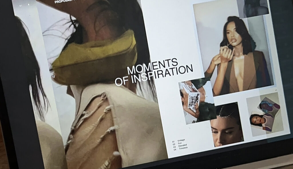
If you can execute it well, visual content has the ability to send a powerful message without having to use so many words.

FULL PODCAST HERE
Whether you’re creating your social media assets, building your website, or just creating a simple brochure, design matters and holds a lasting impression on your current / potential clients.
Below are the our top tips for levelling up your design and, in turn, building a stronger brand presence.
1. Contrast
Distinction between different elements throughout your design can make sure you’re holding the attention of your viewer. You want to utilize contrast in order to highlight the main topics and support the secondary content.
- Example: bold font with thin font; light text on dark background.
2. Creating Hierarchy
Again, making sure you have distinction between primary and secondary content. Start laying out your information in a way where it is easy to understand the order of importance through sizing, numbering, and simplicity.
In very simple terms – you want the info that’s most important to get across to your audience to stand out and grab their attention. THEN you think about your supportive copy / evidence to help hook them once they’re locked in.
- Example: blogs have a title, header, sub-header, paragraph to make it clear for the reader. This helps grab the attention of skimmers and entices them to spend more time on the article.
3. Sizing and Proportions
Allowing proper spacing between elements can create a clean look and allows the main topics, images, and key information to stay at the forefront for readers.
A great way to assess this with fonts is the 50% rule. I like to think if my main title / header font is size 30, your supporting information / sun-header should be around 15. This gives the viewers eyes a much better chance to take everything in.
4. Keep Things Simple!
There’s tooooo many distractions for your branding to be all over the place. Especially if you’re trying to explain important information to your audience, it can be a real challenge. Think of them as real people- they also go down the never-ending scroll. How are you capturing them?
We could chat about this topic all day, but here are some quick tips:
- Don’t try to fit every bit of information into a design or piece of content. Think of the main topic and a supporting piece of information. If we’re talkin IG content – use the features they give you! Create a carousel post that keeps your readers engaged. Long text on posts is intimidating!
- Tone it down on the wild fonts… lol but really. Think about what catches your eye and actually gets your attention. Often, it’s minimal design that shows you exactly what you’re getting. I know how enticing these wild trendy fonts can be but if they’re detouring your audience from reading the actual content or getting the message.. is it worth it?
5. Use White Space to Your Advantage
White space is the “emptiness” around your main subject. Think about an Instagram feed here – it’s INTENSE to look at a feed with an overwhelming amount of busy pictures with text. It’s overwhelming and hard to focus let alone get any real sense of direction.
We go into more details on each one of these elements in our weekly podcast. — Listen here and lets us know what you’re interested in hearing next!
x Mel

